Easy Custom Inspector Tools
As we were developing our games, we came up with tools to simplify and fasten our work. As we found them really useful, we wanted to share. This package contains some tools that we thought could be useful. Right now, this is mostly some attributes to add missing things in the Inspector. We plan to add many more soon.
Attributes
Colored Header
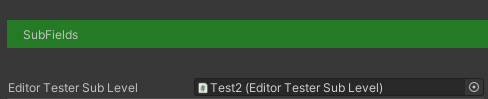
As we add more and more element to some of our Monobehaviour, we needed some way to categorize and retrieve useful information. So we wanted to add some way to add colored headers to identify headers.
To add this colored header, you just have to add a ColoredHeader attribute where you want it to appears. This attribute takes two parameters :
- a label text
- the color of the background of the header (as a hexadecimal string)
[ColoredHeader("SubFields", "#00FF0055")]
public EditorTesterSubLevel EditorTesterSubLevel;
Subview
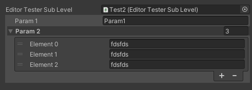
We sometimes wanted to link the current component to an other Monobehaviour and be able to modify the data of the two components at the same place.
For example, if you have two monobehaviour classes EditorTester and EditorTesterSubLevel and you want to be able to chose an EditorTesterSubLevel in the EditorTester class and be able to change the EditorTesterSubLevel object data when seeing the EditorTester component.
This attribute uses one attribute: a string containing a list of the displayed properties of the “sub” class. If the parameters is null or an empty string, all the properties are displayed.
 public class EditorTesterSubLevel : MonoBehaviour
 {
     public string Param1;
     public List<string> Param2 = new List<string>();
     public bool Param3 = false;
 }

 public class EditorTester : MonoBehaviour
 {
     public string test;
     [SubField("Param1;Param2")]
     public EditorTesterSubLevel EditorTesterSubLevel;
 }
-
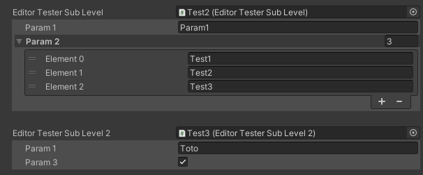
Hide in Subview
When using the previous attribute ([Subview]), you may have some property in the “sub” class that you need to hide from the “parent” class. So you can add an attribute [HideInSubview] that we’ll hide this property in any [Subview] attribute.
For example, if you’re still using the EditorTester class and you want to have an EditorTesterSubLevel2 class where you want to be sure that the property Param2 is not shown, you’ll use the following code.
 public class EditorTesterSubLevel2 : MonoBehaviour
 {
    public string Param1;
    [HideInSubview]
    public List<string> Param2 = new List<string>();
    public bool Param3 = false;
 }

 public class EditorTester : MonoBehaviour
 {
     public string test;
     [SubField("Param1;Param2")]
     public EditorTesterSubLevel EditorTesterSubLevel;
     [SubField]
     public EditorTesterSubLevel2 EditorTesterSubLevel2;
 }
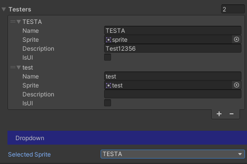
Asset List
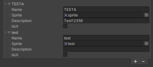
In some case, you want to have a list of assets with many parameters and you want to be able to select this assets using an asset selector as used everywhere in the Inspector.
For example, if you want to have a list of sprites with many parameters associated, you create a class for the Sprites and their info, add a List of this class in your Monobehaviour object and add ListManager attribute
The ListManager attribute has four parameters:
- a string defining the name of the property used to store the info of the linked asset
- the type of the asset (ie: Sprite, SceneAsset, etc.)
- a string defining the name of the property used as a name for the asset. This parameter is optional and if not set, it tries to use a property named Name (if found). When the asset is selected, the defined property is filled with the name of the asset.
- a string defining the label of the “path” field. It is optional and if it’s not set the name of the property is used.
 [Serializable]
 public class SpriteTester
 {
     public string Name;
     public string Path;
     public string Description;
     public bool IsUI = false;
 }

 public class EditorTester : Updatable
 {
    [AssetList("Path", typeof(Sprite), "Name", "Sprite")]
    public List<SpriteTester> Testers = new List<SpriteTester>();
 }
Linked dropdown
In some cases, we had a list of elements and we wanted to be able to select one of them for another use. So we put in place a Linked Dropdown attribute to this.
For example, you have a list of sprites as set in the previous attribute, and you want to have a dropdown to select one of this sprite as the main one. So you set a string property and add a LinkedDropdown attribute.
This attribute has three parameters :
- a string defining the property of the source list
- a string defining the list property used to populate the dropdown. If the source list is a list of strings, this parameter has to be null or empty
- a string used as a label for the dropdown. If this parameter is omitted, the label use the name of the field.
 [LinkedDropdownAttribute("Testers", "Name", "Selected Sprite")]
 public string DropDown = "";
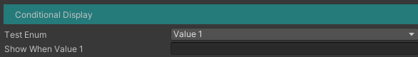
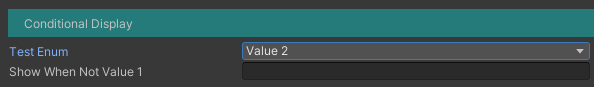
Conditional Display
This attribute allow to display a property depending on the value of another property.
For example, if you have a dropdown with two value, you can display another field depending of the value of the dropdown.
For now, this attribute only have two conditions: equals (“=”) and not equal (“!=”). We planned to add more condition type soon.
This attribute has three parameters:
- a string defining the name of the condition property
- a string defining the condition (“=” and “!=” for now)
- an object defining the value that we want to compare to the property;
 public TestEnum TestEnum = TestEnum.Value1;

 [ConditionalDisplay("TestEnum", "=", TestEnum.Value1)]
 public string ShowWhenValue1 = "";
 [ConditionalDisplay("TestEnum", "!=", TestEnum.Value1)]
 public string ShowWhenNotValue1 = "";
Special Class
Updatable
As we developed other tools, we came across a problem: we needed a simple way of having a controller that would react in some way when its properties were updated in the inspector.
To do this, you just have to make your current class extends the Updatable class and implements the OnUpdate method. Updatable inherits from the Monobehaviour class so you can use it just as if it was a Monobehaviour.
 public class EditorTester : Updatable
 {
	 public string test;

     public override void OnUpdate()
     {
         Debug.Log(DateTime.Now.ToString("G") + " UPDATED");
     }
 }
With the previous code, any time you’ll update a property of a EditorTester controller, one line will be added in your log.